

Understanding cryptocurrency charts and the information they deliver is essential if you want to delve into the world of crypto trading and investing. They can be too confounding at first but once you’re familiar with it, you’ll be breezing your way through data and making informed decisions in a snap.
To help you get started, here are core concepts you need to know before navigating the expansive world of crypto.
Types of market analysis
There are two main ways for you to analyse the market and make informed trading decisions, namely, the fundamental and technical analysis.
Fundamental analysis
This kind of analysis looks at the bigger picture and considers other factors beyond the chart. It considers recent events in the world, especially in the economic and financial sectors.
Technical analysis
In contrast with fundamental analysis, the technical analysis relies solely on the information provided by the chart, including its past performance. The underlying idea is that historical data can indicate how the market is likely to behave in the future which helps investors make informed decisions.
Understanding the Dow Theory and its six tenets
Dow Theory is fundamental in reading and understanding cryptocurrency charts. It has six tenets every trader should be familiar with. Once you grasp the underlying concepts in Dow Theory, you can understand how and why the chart is moving the way it does.
1. The market has three types of movements
According to the Dow Theory, the market moves in three different ways that can happen simultaneously. These trends are key to understanding how the market feels about the asset:
- Main movement – The long-term outlook that can last from less than a year to several years
- Medium swing – Involves price swings that occur in 10 days to three months
- Short swing – The minor and shortest movement which counts prices from at least hours to a month.
2. There are three phases of market trends
Major trends are divided into three phases that happen in sequential order:
- Accumulation phase – Happens at the beginning when only a handful of knowledgeable investors buy or sell assets
- Absorption phase – The market catches on with initial investors and starts following the trend; speculation begins and more people buy, sparking price increase
- Distribution phase – Knowledgeable investors start selling their holdings to the market, causing prices and volume to drop.
3. The markets discount all news
News from all sectors around the globe affects the movement of the market. Whether they are positive or negative news, the chart will instantly reflect how market participants react.
4. Market averages must confirm each other
Markets of related assets should have similar movements. For example, if the agriculture market has low supply with high demands, prices will go up and the chart will start climbing.
5. Volume confirms trends
The market is driven by supply and demand coming from market participants. Another key factor in recognizing price signals is the volume of transactions or trades. During an upward trend, the volume increases with more people buying. As a result, price increases.
During a downward trend, the volume decreases with fewer participants in the market, causing a price decrease.
6. Trends exist until they don’t
No one knows for sure when a trend will end because it only becomes clear once it has passed. Even with loud market noise, this does not determine whether a trend has ended or not.
Japanese candlestick chart
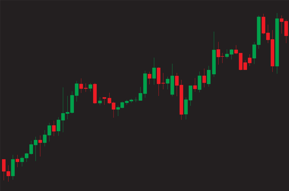
There are different types of charts and one of the most popular types is the Japanese candlestick chart. If line graphs have lines and bar graphs have bars, the Japanese candlestick chart has candlesticks to represent data.
A candlestick looks similar to a bar but what differentiates it are the two protruding lines you can find on the top and bottom. Compared to other charts, the candlestick chart reveals more data in a streamlined way. Each candlestick reveals how an asset’s price performed in a given time.
Just like the usual charts, candlesticks come in green and red. If the candlestick is green, it means the price moved up, and if the candlestick is red, it means the price dropped overall during the course of a day.
Each candlestick differs in height which is indicative of the price movement. The bottom end of the stick represents the opening price of the asset while the top end represents the closing price. Between the two ends lies the body which reveals the difference between the two prices.
The lines protruding out of the sticks are called shadows and they show the highest and lowest points of the price over the time period.
Technical indicators
When viewing the chart on a trading platform, there are technical indicators that will help you get the information you need. You can customize how you want to view the chart by clicking on the settings of your preferred exchange site.
Relative Strength Index
The Relative Strength Index or RSI measures price movement by comparing the current price to its previous performance. It indicates whether the asset you’re viewing has been overbought or oversold.
The RSI formula looks like this:
RSI = 100-(100(1-RS)) where RS stands for the average days the asset’s price was up or down. You’ll find a number from 0 to 100 as the RSI indicator. If the number is more than 70, it means the asset’s price is about to drop. If its value falls below 30, then the price is likely to rise.
Support and resistance levels
The support level is the lowest price an asset has dropped to multiple times before climbing again. On the opposite side, the resistance level is the highest price the asset has reached a number of times before dropping.
These levels represent two points where traders are purchasing an asset and selling them to generate profit. In contrast with trends that are either upward or downward, support and resistance levels are horizontal lines in the chart.
Simple Moving Average
Another indicator is the Simple Moving Average which creates a streamlined view of the chart by getting the average of previous data points. You can easily view this line by clicking on the indicator tab of your chosen exchange site.
Bollinger Bands
Bollinger Bands appear in conjunction with the simple moving average and indicate the volatility swings of the asset’s price. They appear at the standard deviation levels above and below the simple moving average line. The thicker the band, the higher the volatility while the thinner it is, the lower the volatility.